Case Study Category: Brand Naming

  • Logmans

    Logmans

    Logmans

    • Brand Naming
    • Brand Strategy
    • Visual Identity
    • Website Development
    Client

    Logmans

    Category

    Forestry & Timber Products

    Logmans supplies premium ironbark and quality hardwood to families, campers and local businesses across Brisbane’s northside and beyond. 

    Rehaula delivered a new visual identity and website to evolve the brand in line with its growth and reputation.

    The result is a clearer, more confident brand that reinforces trust, quality and reliability whilst maintaining a sense of personality – giving Logmans the presence to own its region as the number one choice for premium timber supply. 

    Logmans has built a strong reputation for quality timber and reliable service across Brisbane’s northside, but its brand did not fully reflect that standing or support its continued growth.

    In a competitive local market where familiarity and trust drive purchasing decisions, the business needed a clearer, more confident presence to reinforce its position and stand out as the go‑to supplier.

    To move forward, Logmans needed to evolve its brand in a way that matched its reputation and strengthened its leadership in the region.

    The key challenges were:

    • Competing in a local market where trust and familiarity heavily influence buying decisions 
    • Aligning brand perception with the quality and reliability the business is known for 
    • Establishing a stronger presence as the preferred supplier for families, campers and local businesses.
    Visual Identity

    We evolved Logmans’ visual identity to better reflect the quality and reliability the business is known for. The system was designed to be engaging and easy to recognise, strengthening presence and reinforcing trust and approachability. As part of this, we refined the existing logomark and character to create a more consistent and cohesive finish, lifting the overall brand and improving recognition in market.

    Website (Shopify)

    We designed and developed a streamlined Shopify website to make it easier for customers to understand the offering and place orders. The site simplifies the buying process, improves product clarity and supports Logmans’ position as a dependable, go‑to supplier in the region.

    Stronger local market presence

    Logmans now sits as an industry leader with greater confidence and visibility, reinforcing its position as a trusted, go‑to supplier across Brisbane’s northside.

    Improved recognition and consistency

    The refined identity strengthens how the brand shows up in market, creating a more consistent and recognisable presence across all touchpoints.

    Simplified path to purchase

    The new website makes it easier for customers to find, understand and order products – supporting faster, more confident buying decisions.

    Positioned for regional leadership

    With a clearer, more aligned brand in place, Logmans is better equipped to build trust, win preference and lead in its local market.

    What our clients have to say.

    Behind every brand, website and marketing activity is a business that trusted us to get it right.

    Rehaula knew exactly where we wanted to go with our brand, we’re all about our local community, and care about quality firewood. As a company commited to ensuring people to have a good time, we absolutely love our tagline, name and logo and soon to launch website. Thank you Rehaula!

    Ethan. S
    Logmans

  • Essier

    Essier

    Essier

    • Brand Naming
    • Brand Strategy
    • Visual Identity
    Client

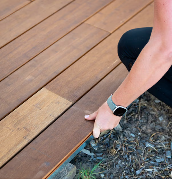
    Essier Bamboo Decking

    Category

    Building Materials

    Essier engaged Rehaula to redefine its position in a decking market where sustainability greatly needed.

    Leading a full brand strategy, renaming and visual identity, Rehaula repositioned the business as a category leader championing circular solutions as the standard, not the alternative.

    The outcome is a credible, future‑focused brand positioned to lead the category and shift how sustainable decking is valued.

    Essier was operating in a decking market driven by price, familiarity and short‑term decisions, where sustainability was acknowledged but rarely decisive. While their solution was designed to lead industry change, the brand lacked the authority and clarity to challenge entrenched norms and compete at a higher commercial level.


    The key challenges were:

    • Standing out in a crowded, price‑led category
    • Building immediate credibility with specifiers and partners
    • Reframing sustainability from an alternative to the industry norm.
    Brand Strategy

    We defined a clear brand position, value proposition and messaging framework to shift Elysium Decking (soon to be Essier) from a sustainable alternative to a category leader. This strategic platform reframed sustainability as a commercial advantage, giving the business clarity, confidence and alignment across all touchpoints.

    Brand Naming

    Renaming the business from Elysium Decking to Essier marked a deliberate step away from category conventions, creating space for leadership positioning and long‑term growth. The name supports differentiation, credibility and relevance within a mature, price‑led market.

    Visual Identity

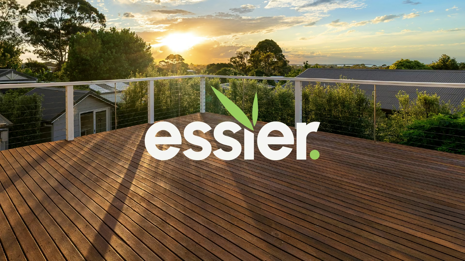
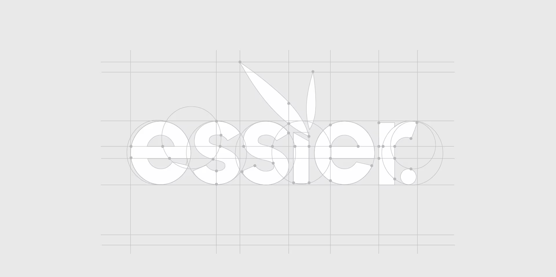
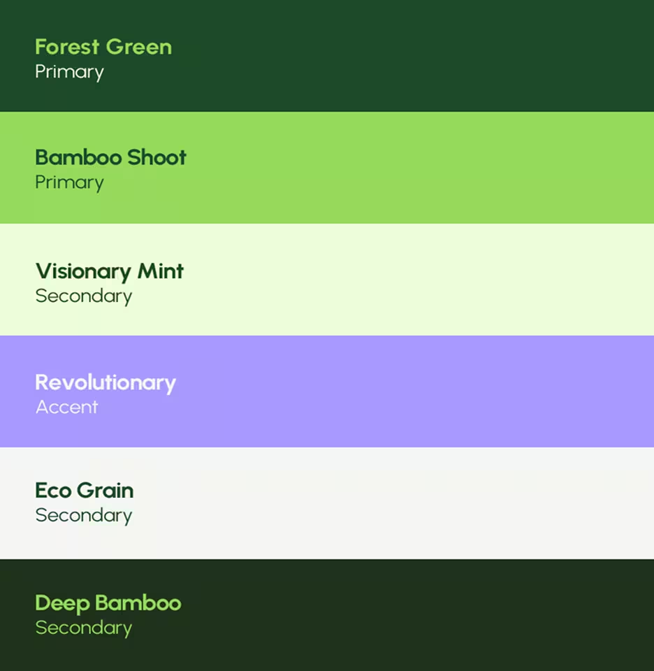
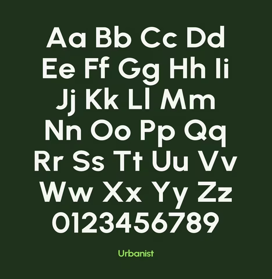
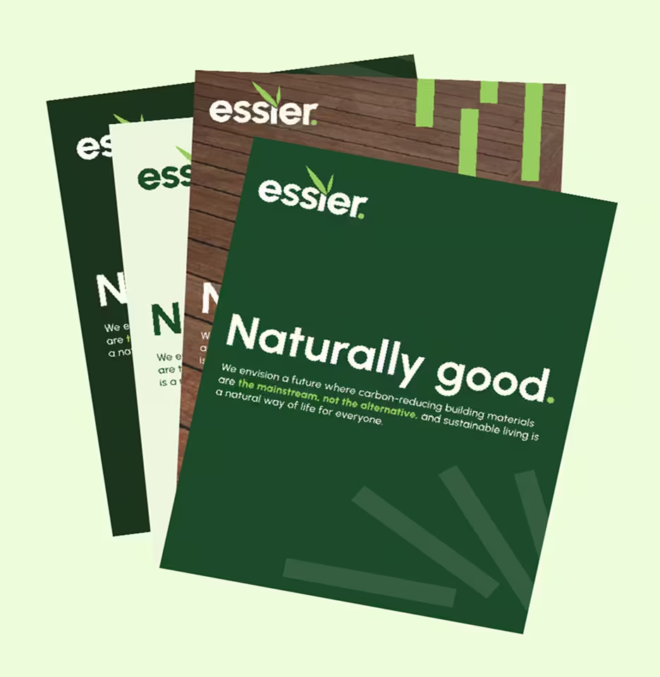
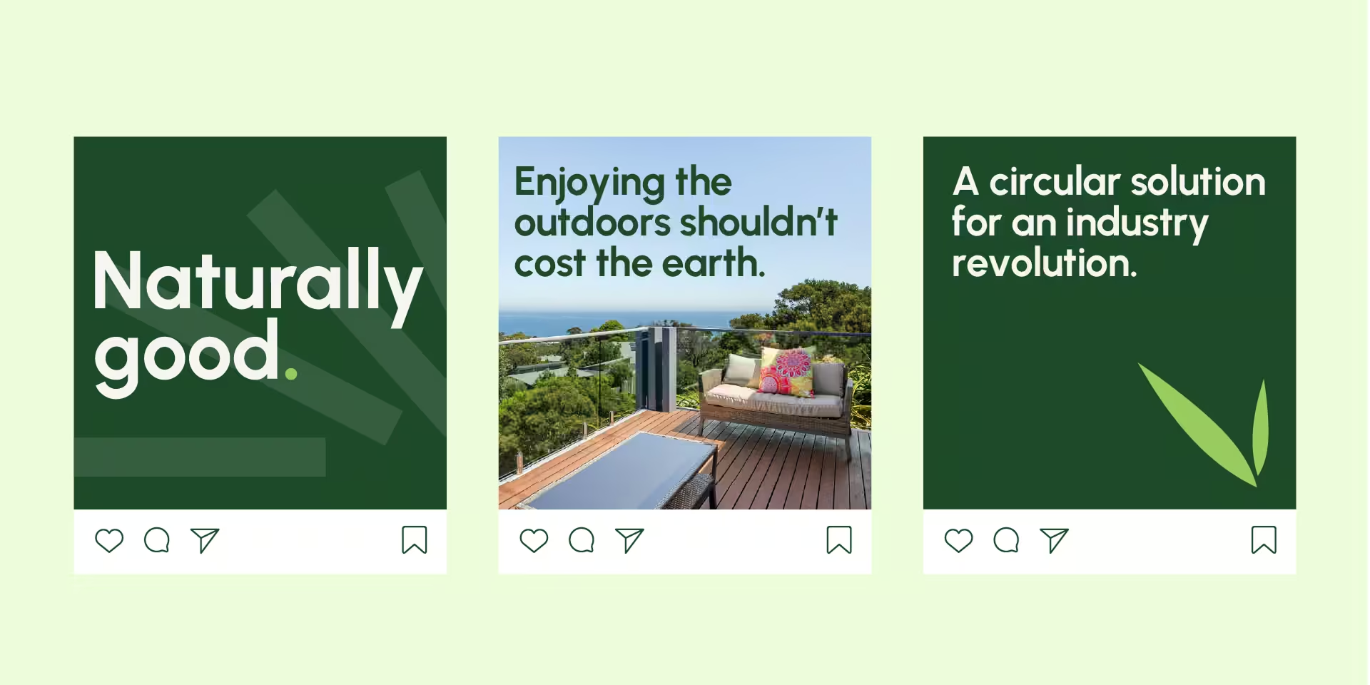
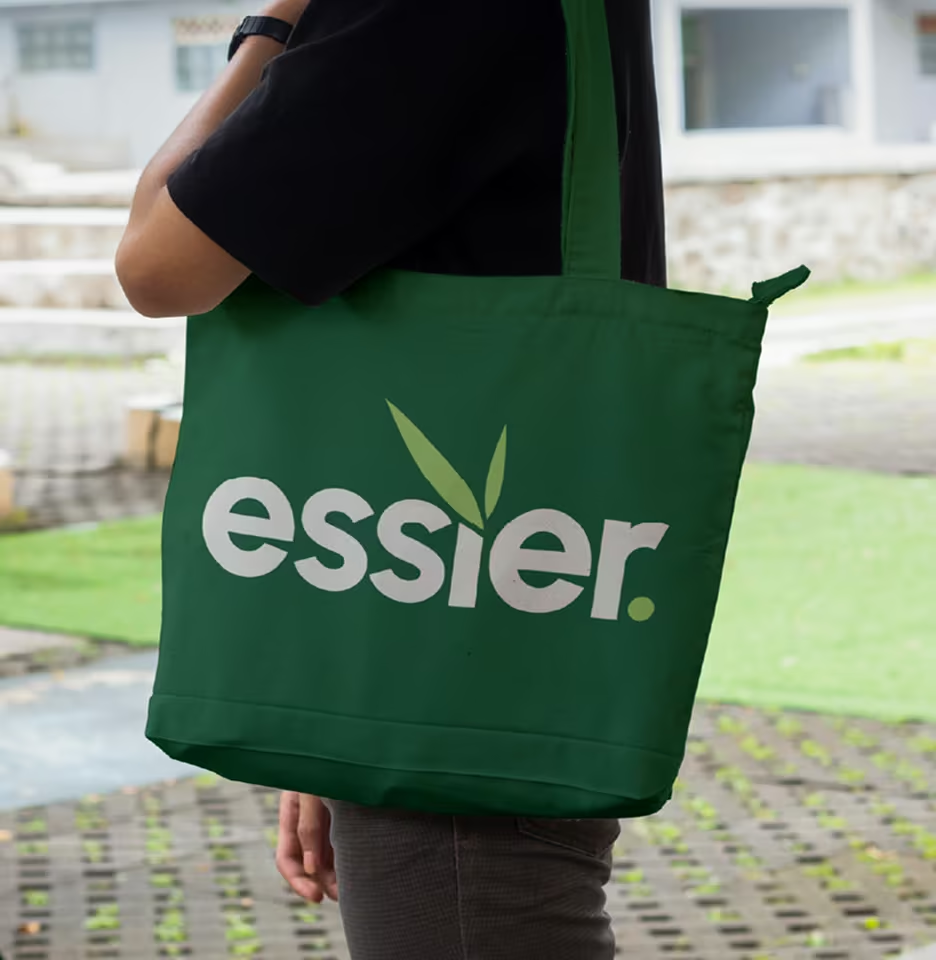
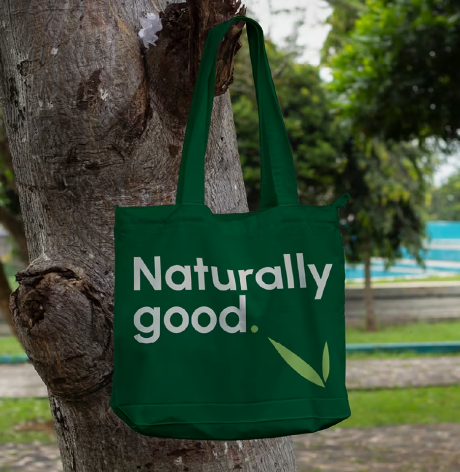
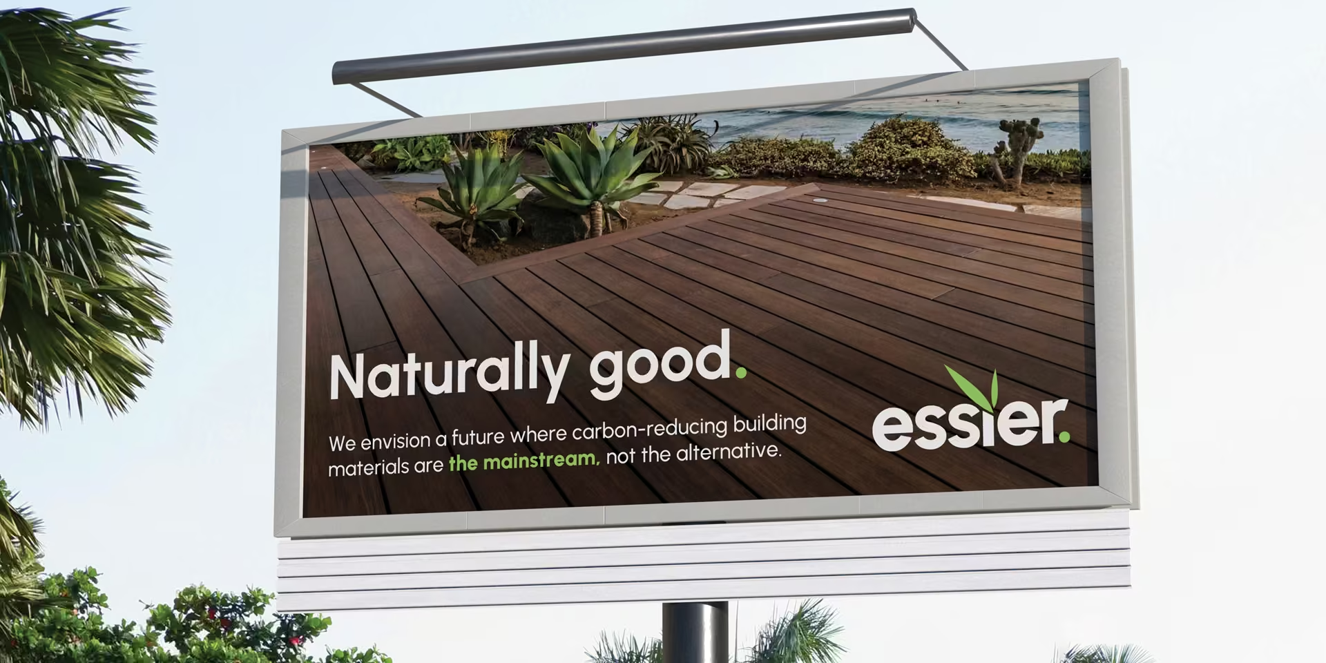
    We developed a refined, distinctive visual identity, including logo, colour palette, typography system and supporting elements, grounded in practicality rather than superficial luxury. The system reflects Essier’s role as a brand that simply makes sense, reinforcing trust, clarity and long‑term usability.

    Clear Category Leadership

    Essier now occupies a distinct leadership position, reframing sustainability from an alternative option into a practical, responsible standard within the decking category.

    Stronger Commercial Credibility

    The new brand builds immediate trust with industry partners, specifiers and customers, supporting higher‑value conversations and long‑term partnerships.

    A Platform Built For Growth

    With a clear brand strategy, name and identity in place, Essier has a scalable foundation to support expansion, consistency and future product innovation.

    A Good Brand For

    All
Essier is now free to create positive impact across the entire value chain, from the suppliers and partners that bring it to life to the customers that choose it and the planet that benefits every time they do.

    What our clients have to say.

    Behind every brand, website and marketing activity is a business that trusted us to get it right.

    “THIS! What most people miss (myself included) is the research that precedes the brand. I was all too keen to jump right in, thinking I know what my customers want or how to position my business. What Amber does is look at the ocean, see what’s red (and full of competition) but also see where there’s blue.”

    Joeri Tuijn
    Essier